How to Create Beautiful,
Vibrant Watercolor Paintings.
(30 Videos-18 Tutorials) All Free.
Tips and techniques for beginner through advanced. These teaching videos, lessons, tutorials
and demonstrations are free
Lessons On Watercolor Materials
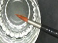
 Watercolor
Paints – What they are and what you will need.">
Watercolor
Paints – What they are and what you will need.">
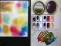
The word, “palette” means two different things. First it’s what you put your paint on. Second, it’s your available paints, in other words, not only the number of paints, but what their specific color and properties are. There is no perfect palette, and what works for me may not work so well for someone else. Therefore what I am offering is a starting point. Hopefully you will also find it to be all you need. We will cover the sedimentary properties of colors, which are what makes watercolors look so unique, and what makes them so beautiful. We will also cover a palette for mixing any color at all.
 Watercolor
Paper
Watercolor
Paper
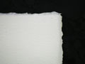
The “look” of your painting, will be determined by the paper it’s painted on. Cheap paper can often be a very good choice, but good paper is a pleasure to use.
Also the ease and cost of framing will dramatically change by selecting the right size paper to use.
This lesson will cover what you need to know about watercolor paper.
 Watercolor
Tools
Watercolor
Tools
Besides paint paper and brushes, there are a bunch of tools which make painting faster and easier.
Of course there is your palette. You will also need the right pencil and eraser, which is surprisingly simple. Other tools like scraping tools are easily made from credit cards and plastic spoon
 All
About Brushes.
All
About Brushes.
This lesson covers the different brushes I use and how to use them. Also what these brushes are made of, and what what are the implications of the fibers regarding quality. durability and cost.
 Watercolor
Brushes – What to look for when buying them.
Watercolor
Brushes – What to look for when buying them.
Buying watercolor brushes can be an overwhelming experience. There are way too many choices.
Brushes come in many different sizes and different are made with many different fibers. They also come in different shapes, and it’s bewildering to confront a catalogue or store display. There are way too many choices.
Experienced painters don't use dozens of brushes. Often they use only a few. You too can have just a few brushes that can do everything you want to do.
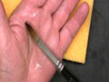 Watercolor
Brush Care
Watercolor
Brush Care
Without the proper care, brushes don’t last too long. It’s not hard to care for your brushes. Funny thing is, in my experience, not one single teacher has told me how.
We will also cover how to repair a brush that has gone bad.
LESSONS ON Drawing - Elementary
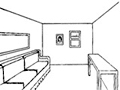 #1 - Drawing Using One Point Perspective
One point perspective is probably the best entry point for anyone wanting to draw. That's
because it has rules. Rules are wonderful because you can follow them. The further we get into art,
the fewer the rules; also the more meaningless the rules.
#1 - Drawing Using One Point Perspective
One point perspective is probably the best entry point for anyone wanting to draw. That's
because it has rules. Rules are wonderful because you can follow them. The further we get into art,
the fewer the rules; also the more meaningless the rules. So start here. You will be happy you did, or your money will be cheerfully refunded.
 #3 - Drawing Round Objects In Perspective
Linear perspective applies to everything, including round things. When you see it done,
you will realize that you knew it already. Nevertheless, its not intuitive. This lesson will make
handling round objects easy.
#3 - Drawing Round Objects In Perspective
Linear perspective applies to everything, including round things. When you see it done,
you will realize that you knew it already. Nevertheless, its not intuitive. This lesson will make
handling round objects easy. Just make sure you start with the previous lessons, one and three point perspective.
 #2
- Drawing Using Two And Three Point perspective
Three point perspective may be the key concept for anyone wanting to draw. Once you are comfortable
with this YOU CAN DRAW. Its only the foundation, but it will take you very
far.
#2
- Drawing Using Two And Three Point perspective
Three point perspective may be the key concept for anyone wanting to draw. Once you are comfortable
with this YOU CAN DRAW. Its only the foundation, but it will take you very
far.
So do this lesson as I did it, and practice it until you have got it
Just make sure you start with the previous lesson, one point perspective.
LESSONS ON PAINTING - Beginner
 A
First Watercolor Lesson. It's about paint handling, and "value"
A
First Watercolor Lesson. It's about paint handling, and "value"
Here is a simple “coloring book” exercise which will equip you to dig into your first painting.
You will learn how to make a “wash”, and how to adjust the “value” (the relative difference between dark and light) of your wash.
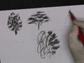 Painting
Trees – Part 1
Painting
Trees – Part 1
You need to get a “handle” on trees. They are fairly easy if you know how to approach the task.
Tree color is also, an issue. In reality, I paint trees in any color I feel like at the moment, but the beginner is going to want at least a little credibility. You need to know how to get the right kinds of greens. And greens can also mean reds or blues or yellows when it comes to trees. This lesson is full of tips and tricks for watercolor painting of trees.
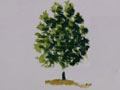 Painting
Trees – Part 2
Painting
Trees – Part 2
It’s good to know how to approach painting a tree, but that’s not enough. Part 2 is a demonstration of how I do it, at least at the beginner level.
You will see how to paint in the leafy areas and then how to handle the trunk, branches and twigs.
We will examine “Sky holes”, and the general “look” of a realistic tree painting.
Preparing
paper for wet in wet painting
It sounds easy, but you gotta do it right.
it is easy, but its not intuitive and the lesson is really short. Give it a watch unless you are very confident in your wet in wet watercolor technique.
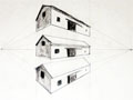
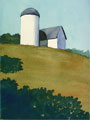
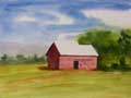 A
small barn makes a nice beginner landscape painting
A
small barn makes a nice beginner landscape painting
In this simple yet far ranging painting will cover the beginnings of perspective drawing. You will become conscious of light sources and the shadows that result from them. There will be some easy, yet sophisticated concepts, introduced. These include implied edges, and massing objects to solidify composition. Its also the first lesson which I am truly happy with. ( That does not mean that I don't see flaws sticking out like mad. )
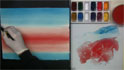 How To Paint Dawn and Sunset Skies - Sunrise / Sunset - Part 1 - Skies with multi
hues.
How To Paint Dawn and Sunset Skies - Sunrise / Sunset - Part 1 - Skies with multi
hues.
These skies need to be smooth yet are very interesting. Here we paint a sunrise with an orange red horizon fusing smoothly into a blue green sky. We are after convincing the viewer that they are looking at what might be a photograph. The sky is not the focus of the painting, rather the backdrop for a seascape, landscape. The mid ground is the actual subject but it is subtle, so it needs a dramatic frame to focus the eye. That is supplied by the intense value of the foreground.
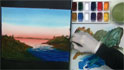 How
To Paint Water and Islands - Sunrise / Sunset - Part 2?
How
To Paint Water and Islands - Sunrise / Sunset - Part 2?
Poetically speaking, these are islands in the sky. In reality the are the props for the subject,which is my favorite lighthouse. There is Fire Island off in the distance, and two other islands with the "snake hill channel" between them forming the dramatic foreground. Ya gatta love the drama in this painting and its all done with a few simple elements. The trick is the intense value and color contrasts
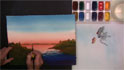 Lifting
and Painting The Lighthouse
- Sunrise / Sunset - Part 3 - Lifting out the lighthouse.
Lifting
and Painting The Lighthouse
- Sunrise / Sunset - Part 3 - Lifting out the lighthouse. Here we see one of the many techniques used for lifting watercolor paint. Even though the background sky is painted with a richly staining paint, we can lift enough of the paint to give the impression of a white lighthouse. This is a real scene, and this is a real lighthouse. it is Fire Island Light. It is part of my everyday world, and you can probably feel my reverence for the place.
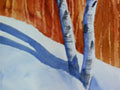 Aspens – A
snowscape.
Aspens – A
snowscape.
The basis of this lesson is scraping away wet paint. It’s an important watercolor technique. In this case we will create a forest with very little effort.
The forest is the background for a double trunk tree surrounded by snow. Snow is a challenge to paint until you know how. Shadow and color is the basis of convincing snow.
LESSONS ON PAINTING - Intermediate
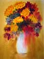 Bouquet
of Flowers - A Wet In Wet Floral Painting
Bouquet
of Flowers - A Wet In Wet Floral Painting
The queen of watercolor painting techniques is wet in wet. This difficult but rewarding way of applying paint will amaze you, once you master it.
We work with the "sedimentary" properties of our paints. They diffuse outward and settle downward at different rates. This gives us the "wet in wet effect". On a small scale, the color is very broken. On a larger scale the edges are soft. We get electrifying results painting this way, and I will show you all of my tips and tricks.
 Creating
Depth
Creating
Depth
Depth is perhaps the single most important element in any landscape painting.
Creating depth requires several different skills. You will learn how to do it, and, most important, why.
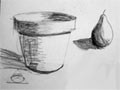
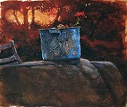
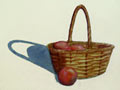 How
To Paint A Basket - Part 1
How
To Paint A Basket - Part 1
Baskets are favorite subjects for watercolorists, and they always look so difficult to paint. In this lesson I will show you the easy way.
Part of the lesson will be the use of watercolor medium’ gum Arabic” and also the use of masking fluid
How
To Paint A Basket - Part 2
Here we finish the painting by adding the fruit and shadow to the basket.
This part covers a little about warm and cool colors and a little about shadows in general.
LESSONS ON PAINTING - Advanced
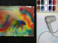
 Monoprinting
using plastic wrap - Easiest Painting ever..
Monoprinting
using plastic wrap - Easiest Painting ever..
This as a fabulous way to generate interesting patterns in watercolor paint. Sometimes they are so beautiful that you just want to frame them "as is". I usually use them as a "start." I use a start as the basis for a painting. The final work is always very dramatic, ( or a failure). if its a failure, that's no problem. I just wash off whatever paint I can, an then use it as another start,
 Abstract
Art – A discussion.
Abstract
Art – A discussion. Even if you hate abstract art, you at least need to know what it’s about. If you are a beginner who loves abstract painting, or an old hand who is getting bored, this is for you.
 Using shadows in landscape paintings.
There is so much to know about shadows in the landscape. There are objects in shadow which cast shadows on other things. There are shadows under overhanging surfaces. And there is the special case of foreground shadows which create the feeling of sanctuaries.
A sunny day lifts our spirits. You will learn that the hallmark of a sunny day is blue shadows. The emotional content of a painting is carried by the colors in that painting. The use of the color blue in this case, will definitely communicate a feeling of happiness. You may also come to understand the "blue period" of many famous artists.
LESSONS ON - Color & Composition
 Color For Beginners - Mixing Colors
A lesson on how to mix any color at all, and how to mix it for maximum effect.
Color is my favorite subject. Here you will learn to use the dual primary palette, ( I use it ), and why. We can make every color at all with only 6 tubes of paint. We can also darken them, even to a black, and lighten them to almost white.
 Color Advanced - Warm And Cool Colors - The Emotional Content Of A Painting
In the previous two color lessons we covered the "nuts and bolts" of color. This lesson covers the "touchy - feely" part of color. First it offers a few tips and tricks about speeding up the color learning process. The next part covers the use of color for contrast, such as creating a center of interest. We also learn to use gray to potentiate colors. The main part of the lesson is how to use color to convey feelings.
 Color
For Intermediates - Color Schemes
Color
For Intermediates - Color Schemes
A lesson on how to select color schemes for your paintings. This is not just a watercolor lesson, but is useful with any medium. oils, acrylics, pastels, anything. It is not only a painting technique, but also a technique for your personal life. It's useful for selecting your wardrobe, the clothes you put on now, and interior decorating.
Online Watercolor Painting Tutorials
Thoughts On Watercolor Painting -
An Ongoing Tutorial
Tidbits that other artists might benefit from.
How To Develop A Personal Style
I have some empowering things to say on this subject. If you are seeking a personal style, you
may find this very interesting.
It's All About Value - Lights against darks
Powerful painting with well defined centers of interest are generated using values. This is possibly
my favorite lesson..
Tips, tricks and techniques for painting with watercolors
Here are some things I know are true for me. They are rules that govern my paintings. They may
not suit you, and that's OK.
Notes To My Students - By - Joe Bucci
Joe is a landscape painter who works in acrylics on canvas. These tips about painting apply to
watercolor, and all painting media. I recommend a read.
Watercolor Lessons - By Other Teachers
Why did you start painting?
That's a question I have asked a lot of artists. None came up with satisfactory answers, not even satisfactory to themselves. I confess - same here.
If you ask any of us why we continue painting, that’s a whole new ball game. For all of us, it's been an amazing journey; which never seems to slow down. And here’s the kicker. The journey isn't so much about art; it’s about the most interesting subject in the world, our own minds.
Why do you find something beautiful?
It could be a sunset. It could be a naked body. It could be a baby or a or a bird, a mountain or a galaxy or anything; as long as you find it beautiful. The reason may be elusive, but you can find it. After all, you're the one that decided the thing was beautiful. You are the only person in the universe who can say why. How's that for a challenge. The day you get a handle on the solution is when the problem really begins. Creativity demands that you improve upon that beauty. How, do you ask? That's the problem.
I know I can believe what I see.
Oh yeah? Prove it. Make a drawing of it. Our journey takes us back to infancy and Vision 101. We thought that we are using our eyes to see the world. This time we are going to learn to really see it, not just to approximate it.
Colors are part of this incredible journey. Everyone knows their favorite color. Or do they? Want to know your color? Open your closet. Ta-Da…….
Did you know that you had a blind spot right in the middle of your vision? Excellent Lessons In Watercolor Paintings I can prove it. It's amazing that people live their whole lives never knowing that they're missing the stuff in the middle.
This website offers a lot of practical advice. We start with simple things like brushwork, paint handling, color selection. We advance through very complicated stuff like color theory and composition. But this is all just technique which anyone can learn.
The goal of this website is to study your thought patterns through watercolor painting
- What You Love
- What You Fear
- What You Want
- What motivates you
Why make our journey using watercolor painting? Because I am your guide, and I am Captain Watercolor
In an alternate universe, it might be oil paint and I might be Captain Greasy Mess.
Examples of Great Things You Can do with
Watercolor painting
 I
chose this one to be first because it is so very simple. The composition is almost entirely rectilinear
(Horizontal and vertical lines). It is relieved by two diagonals and an arc (top left). The artist
is Linda Doll.
I
chose this one to be first because it is so very simple. The composition is almost entirely rectilinear
(Horizontal and vertical lines). It is relieved by two diagonals and an arc (top left). The artist
is Linda Doll.
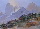
 This
devilishly simple seeming delight by Leslie Klaar speaks with just a few flat colors yet tells
the whole story
This
devilishly simple seeming delight by Leslie Klaar speaks with just a few flat colors yet tells
the whole story
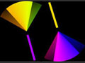
 What
do you think about this little gem, by John Lovett. Its all about the center of interest. How many colors do you see? Even though it seems so colorful,
there is only
What
do you think about this little gem, by John Lovett. Its all about the center of interest. How many colors do you see? Even though it seems so colorful,
there is only
yellow-orange and blue-green. The color harmony is critical here.
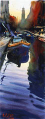
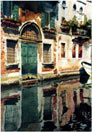 This
reminds me of John Singer Sergeants work. Color is secondary to the values of this elegant composition
by William H. Jones. Of course its a canal scene in Venice. Notice that the color scheme is the similar to the one
above.
This
reminds me of John Singer Sergeants work. Color is secondary to the values of this elegant composition
by William H. Jones. Of course its a canal scene in Venice. Notice that the color scheme is the similar to the one
above.
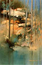
 Thomas Freeman shows us how to push objects back into the distance. See how he expertly uses ever fainter and
less contrast(y) washes to give us such impressive depth.
Thomas Freeman shows us how to push objects back into the distance. See how he expertly uses ever fainter and
less contrast(y) washes to give us such impressive depth.
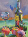 How
about some color. It takes a magician to use every single color in one painting and not make a mess.
This beauty by Wyatt Waters tingles with excitement. There is nothing here except some glass and some fruit, but boy, does it sing.
How
about some color. It takes a magician to use every single color in one painting and not make a mess.
This beauty by Wyatt Waters tingles with excitement. There is nothing here except some glass and some fruit, but boy, does it sing.
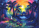 And
if the above isn't enough color for you. consider this painting by Eleykaa Thaleh. Try looking the other way, (if you can).
And
if the above isn't enough color for you. consider this painting by Eleykaa Thaleh. Try looking the other way, (if you can).
 This
amazing painting by Alvaro Castagnet is a study in values, (The contrast between dark and light), The foreground has huge contrast, while
the background has only lighter values.
This
amazing painting by Alvaro Castagnet is a study in values, (The contrast between dark and light), The foreground has huge contrast, while
the background has only lighter values.
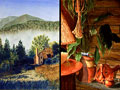
 Dennis Albetski
painted this subtle work using the techniques of watercolor to their greatest advantage. There
was a lot of wet in wet, and flicking going on here. Notice how the blue-green "pops" against
the "red-orange" of the background. They are "complementary" colors.
Dennis Albetski
painted this subtle work using the techniques of watercolor to their greatest advantage. There
was a lot of wet in wet, and flicking going on here. Notice how the blue-green "pops" against
the "red-orange" of the background. They are "complementary" colors.
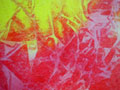
 I
am a sucker for this sort of work by Jeanne Dobie. There is a marvelous intensity to her shapes. Notice that she put a "hole" in the middle.
I think that's kind of cool.
I
am a sucker for this sort of work by Jeanne Dobie. There is a marvelous intensity to her shapes. Notice that she put a "hole" in the middle.
I think that's kind of cool.
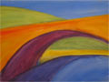
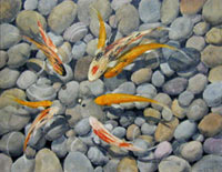 Here
is another example of contrasts. There are only two colors in this painting, blue and orange, "complementary
colors". Check out the composition. It's so "curvilinear". The stones
are round, the fish are arcs, and the subject is a wheel of fish.
Here
is another example of contrasts. There are only two colors in this painting, blue and orange, "complementary
colors". Check out the composition. It's so "curvilinear". The stones
are round, the fish are arcs, and the subject is a wheel of fish.
( Painting by Captain Watercolor )
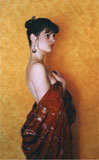 If
you are going to paint this precisely, you better be good, because any flaw will stand out.
If
you are going to paint this precisely, you better be good, because any flaw will stand out.
I like the contrast between the girl with the background.
Notice the "analogous" color scheme. Using only reds and oranges makes this a very "warm" painting.
I reproduced it so large to show the incredible detail. Paul W. McCormack
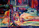 This
is referred to as non-representational art. It is way harder than it looks.
This
is referred to as non-representational art. It is way harder than it looks.
Charlotte Huntley is a master at it because this accumulating of shapes and colors had to be created from nothing
at all.
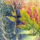 Watercolor
on a textured surface. Thats pretty cool.
Watercolor
on a textured surface. Thats pretty cool.
Here are some other important online art resources:
Handprint (Watercolor Materials Information)The American Watercolor Society
The National Watercolor Society
Art History
The National Gallery
Online Art Forum
Everything on this site is copyrighted,
Nothing may be copied or reproduced anywhere without written permission!