Deciding what colors to use in a painting is more of a science than you think
MATERIALS LIST
Hover Or Click
A Color For Information
Burnt Sienna
A sedimentary color; sediments quickly offering a mottled or shimmery look to the final (wash)
+ close +Viridian
A sedimentary color; sediments quickly offering a mottled or shimmery look to the final (wash)
+ close +Pthalocyanine Blue
A "warm" (greenish) blue.
A non sedimentary color settles out smoothly yielding a uniform finish (wash)
+ close +Pyrrol Red
A "warm" (orangish) red.
A non sedimentary color settles out smoothly yielding a uniform finish (wash)
+ close +Arylide Yellow FGL
A "warm" (orangish) yellow.
A non sedimentary color settles out smoothly yielding a uniform finish (wash)
There is not an industry standard name for this color. I am offering DaVincis Brand name.
+ close +Yellow Ocher
A sedimentary color.
sediments quickly offering a mottled or shimmery look to the final (wash)
+ close +Cerulean Blue
A sedimentary color.
Sediments quickly offering a mottled or shimmery look to the final (wash)
+ close +Ultramarine Blue
A cool (purplish) blue.
A non sedimentary color settles out smoothly, theoretically yielding a uniform final (wash).
Actually Ultramarine Blue "flocculates" (gathers in clumps) so we only get a fairly smooth (wash)
Sadly, it's the only purplish blue thats light-fast and available to artists.
+ close +Alizarin Crimson
( Quinacridone )
A cool (purplish) red.
A non sedimentary color settles out smoothly yielding a uniform finish (wash)
n fact, Alizarine Crimson (a very early man made pigment) lost favor when it was found non light-fast.
Today we replace it it with a better version of the same color called Quinacdridone Red.
Nevertheless, manufacturers still call it Alizerine Crimson.
+ close +A cool (greenish) yellow
A non sedimentary color settles out smoothly yielding a uniform finish (wash)
There is not an industry standard name for this color. I am offering the DaVincis Brand name.
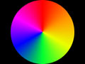
+ close +Color schemes, the painting techniques used to introduce harmony or dissonance to your paintings.
To be effective, color needs to follow a plan. Thankfully, there are only a few plans that really work, and they can be formularized. Very little in art is as easily understood as color. That's amazing, because color is the most subjective of the compositional elements. Beyond the basics of color alone (hue) is the concept of darkening the color (shades), and lightening the color (tints). This is referred to as neutrals and semi-neutrals. Semi-neutrals (potentiate) the colors and make them sing. The color schemes covered are:

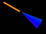
MONOCHROMATIC.
A single hue which can be darkened or lightened but exists alone in a painting.

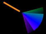
ANALOGOUS. A
group of colors that constitute a wedge of the color wheel. There is no exact definition of the width if
the pie slice, but the narrower the safer. We can safely widen the wedge using semi-neutral colors. Analogous
paintings are always serene, because there is harmony between the colors
COMPLEMENTARY. Colors exactly across the wheel from each other are said to be complementary. Complementary painting setup a contrast and potential conflict because the colors are opposites.
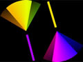
SPLIT COMPLEMENTARY. A
group of analogous colors with the addition of the exact complement of the center color in the analogous
group. This color scheme is the most complicated, colorful and potentially interesting.
It sounds very difficult but in this 10 minute lesson, you will find it quite understandable.. The knowledge gained is not only useful in creating paintings, but also applies to such everyday issues such as getting dressed or furnishing your surroundings.
Watercolor Painting Tutorials Watercolor Materials
A Wet In Wet Watercolor Painting Lesson.
How To Create Depth In A Painting.
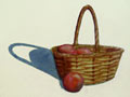
Painting A Basket - A Lesson Lifting Watercolor Paint - Part 1.
Filling The Basket - A Lesson In Painting Objects Part 2.
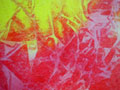
Watercolor Lesson - Monoprinting - Texturing With Plastic Wrap.
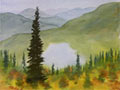
Landscape Shadows. A Demonstration
Color For Beginners - How to mix all the colors.

Color schemes - How to plan the colors of a painting.
How to paint emotions using warm and co
Abstract Art - A discussion.
Everything on this site is copyrighted,
Nothing may be copied or reproduced anywhere without written permission!