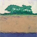
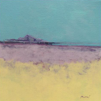
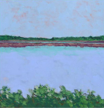
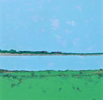
Joe Bucci
Joe is a luminary around Long Island.
He teaches at our local art league,
and sells his art through a Southampton galley.
( Southhampton is a very big deal, big bucks in Southampton.)
Joe sends a wonderful introduction to every student before they begin his classes.
It appears here just after this selection of his work.
ON PAINTING PICTURES
By Joe Bucci
This writing is directed to students of art who are trying to find their way through the confusion of how paintings are made, and to artists with fundamental skills who want to get to the creative level.
Artists, since the beginning of time, all over the planet, have been making marks on just about any surface that would stay still. Some cultures, like the Egyptians, the Africans, and the American Indians were satisfied to beautifully decorate just the front plane of their surfaces, and had no reason to create the illusion of depth.
The effort in this writing will deal with the Western tradition - which attempts to create the illusion of depth on a flat surface, in color, with paint.
Two points are made repeatedly throughout this writing. One, that the subject to be painted is not to be of primary importance in the picture - it only serves as source of information, and two - without an understanding of how and why colors interact when put next to one another on a flat surface - the painter is trusting to luck.
Creating a picture is like being in combat. It is a struggle to control the various color hues, color values, and color temperatures, that all want to do their own thing on a flat surface. Every new mark on a canvas surface causes something else to happen. Colors move in or out, shapes create negative spaces, and lines define and show rhythms. The trained artist tries to anticipate what’s going to happen, while the neophyte just about always becomes a victim of all his/her uncontrolled dabs, splashes and colors that are getting darker and muddier by the minute.
The notion of “self-expression” is so entrenched in the contemporary world of art academia that training is too often frowned upon as interference with the free flow of one’s feelings. It’s not unusual for art students to go through an entire curriculum, splashing, gluing, and scratching - in a vain attempt to mimic (with encouragement from their instructors) the wonderfully expressive work of the American Abstract Expressionist of the 1950’. That movement made the U.S. the art center of the world.
Back in the 50’s, in New York, Abstract Expressionist William deKooning knew where all those colors were going when he was splashing buckets of house paint on huge canvasses. Every splash and slash sits on the plane he wanted it to be on because he was a master of the hue, value and temperature of color He was expressive, but never out of control. Hans Hoffman, of the same school, offered the expression “push, pull” to describe his dynamic surface treatment.
These artists weren’t just indulging themselves: they were acting out the historic tradition of art mirroring its’ culture – remember, the unrest in the America of the 1960’s was in the wings. The Abstract Expressionist movement featured artist whose antennas were out a little further and picked up the coming stimuli and were harbingers of momentous societal change.
SOME FUNDAMENTALS:
Let us proceed with the basic understanding that successful painting takes skill. Just as a musician, must hear and recognize the orchestration of the sounds being made; the trained artist must recognize the relationships of marks being made on the canvas - the goal being to communicate an aesthetic visual statement.
In order for the visual statement to become “art”, it must have abstract quality. It’s not enough that it be a picture of something - it must communicate in aesthetic, visual terms such as composition, color, rhythm, line, texture, mass, and planes. These are often referred to as the plastic elements because their meanings in a picture are so multi purposeful
EMPHASIZE DESIGN ELEMENTS OF THE SUBJECT
Abstract quality refers to an emphasis on the design elements of a painting.
Note the famous hands by Michelangelo from the Sistine Chapel ceiling. The Master was able to communicate a profound statement with just two hands. He made an abstract aesthetic statement about mass, line, rhythm negative space, shape, and even the human spirit. The abstract quality makes the hands more than hands – they become metaphors.
SEE RELATIONSHIPS AMONG THE PARTS
The skill that causes outstanding artist to rise above the pack is not the talent to draw or paint objects; but the ability to see relationships. By “seeing,” I mean noticing the play that is happening on the canvas surface with the visual elements that compose a painting – namely mass, planes, shape, texture, color, rhythm and line. Attention to these elements gives a picture its’ abstract quality, and its’ identity as “art.” Wolf Kahn advises in a book, when responding to a question about his work, “Don’t be too anecdotal.” That’s a wonderfully powerful statement. Meaning, don’t let the “thingness” of the subject be the subject. That is only draftsmanship.
When painting, the artist must see what’s happening, and make decisions to be sure the colors and shapes are sitting on the planes they are identifying on the flat canvas surface. Count on it - they will optically, be moving back and forth. The untrained painter, often, does not see this movement, and will have “holes” or dead passages on the canvas surface. Colors appear to move according to their hue, value and temperature
Hue is the name of a color, and temperature refers to its’ warm or cool appearance. Value
pertains to how dark or light the color appears. Warm colors move forward and cool colors recede.
What I’m describing is not a formula for doing a painting , because every “rule “ can be confounded. A large, light, cool blue shape, for example, will look closer to the surface of the canvas than a lower keyed, smaller, warm red one. It’s just that everything in the picture must be where you say it is. Control of the picture plane is where all the training and skill kicks in.
THE COLOR WHEEL TELLS HOW TO DO IT
It should be obvious that an understanding of the characteristics of color is a necessary tool for any artist to have. If that knowledge is not there, the painter will be on the defense, a victim of the infinite ways color can go. The marketing of unique, manufactured colors for the ubiquitous student market does little to promote this understanding, but mixing your own color does.
PRIMARY COLORS
The color wheel identifies colors and places them according to their warm/cool relationships, with other colors. There are the Primary colors- Cadmium Red Deep, Thalo Blue, and Cadmium Yellow Light. The Primary Colors contain no pigment from any other colors. They cannot be mixed. They must be bought. Light rays bent through a prism, or a rainbow will demonstrate that the sequence of Primary colors are warm to cool – red to yellow to blue. Next to the Primaries on the wheel are colors that are warmer or cooler, depending upon how much red, or yellow pigment they contain. For example, Thalo Blue becomes Ultramarine Blue, and warmer, with more red in it. Cadmium Yellow Light becomes Orange and warmer with red in it, and cooler and greener with blue added. Cadmium Red Deep becomes cooler and Purple with blue added to it Thalo Blue becomes warmer and green with yellow added.
On a flat surface, colors of equal value appear to move forward, or recede depending on their temperature and size. Warm colors want to move forward and cooler colors recede – this is a scientific fact, and critical to picture plane control.
The pallet I’m advocating calls a warm and a cool of each Primary Color plus white. That is all you need! Of course you can expand your pallet to include more colors that would fall into other places on the wheel, but be sure the criterion for the choice is – how does the new color’s temperature relate to your painting.
SECONDARY and COMPLIMENTARY COLORS
The orange, purple and green colors found on the wheel are secondary colors, and are arrived at by mixing two primaries. The third primary that wasn’t used in the mix becomes the complimentary color . For example – blue and yellow make the secondary color green. Red is the complimentary to green
The artist must be constantly evaluating color temperature (how much/ little red or yellow it has in it) when mixing secondary and complementary colors to achieve a desired result. Ultramarine blue and cadmium yellow medium will make a brownish green because both colors contain red pigment. Thalo blue and cadmium yellow light (pure colors) will make a bright green. It is obvious from the color wheel that a wide temperature range of colors is possible.
Adding a complimentary color to it’s primary will beautifully gray the primary. If, when mixing the two, a muddy color is beginning to happen, do not add white. White pigment tends to flatten and cool a color. Beat the muddy look by adding some more of one of the original colors.
Complimentary color schemes harmonize well because all three primary colors are used in varying proportions. Try experimenting. For example, make a green and then gray it with Cadmium Red. Make the same green and gray it with Cadmium Red Medium (more yellow in it) and note the difference. Still playing with the green – make it a purple by adding more red and blue. You will get a purple that you can’t buy anywhere.
It is often necessary to add white to colors and color combinations to bring out the hue that you want. To make a workable purple, you will need to add some white to the combination of red and blue. Adding white to a green mixture will beautifully flatten the color to replicate foliage. Just be careful with it.
EARTH COLORS
These are the siennas, ochres, and umbers. They have no place as, original colors, on a student’s palette. They will confuse. When you complete your successful painting, you
will see the burnt siennas, yellow ochres, and raw umbers are there, having been achieved spontaneously when dealing with color temperature and value.
A trained artist will expand his/her palette over the years, and when developing a personal style, will add colors and techniques that meet a need. That’s the time to add earth colors to your repertoire.
NOTES ON MIXING COLOR
You want to think about the impact one color is going to have on another when mixing pigment. How much red/yellow does it contain?
1. The red in Ultramarine Blue could push some mixtures toward brown.
2. Add Cerulean Blue to a purple and you will be looking at green because of all the yellow in the blue and all the blue in the purple.
The literature tells us to gray a primary with its complimentary color. So there you are with an Ultramarine Blue band of color that you want to get a softer by graying it. Orange is the complimentary – but which orange? Depends what you are after..
There are great opportunities for play here. Say, for example, you are looking for a green color for foliage that is deep in your painting - against a purplish background. Say the purplish background was arrived at with a mixture of Thalo Blue, Cadmium Red Deep, and a little white. Take that same purple back ground mixture and add to it as much yellow and blue that it takes to get green. You might need to add some white. Now you have a green that is not out of a tube with a label on it, and has all the background colors in it. Excellent chance for color harmony and orchestration here. Be careful with the color proportions to preserve color integrity. This will take time and experimentation, and the end result will be worth it. You, and you alone will be in control of the color impact of your painting.
Arrive at color solutions with a warm and a cool of each primary – plus white; and your chances of successfully creating harmonies are greater than with a pallet that contains a mound, squeezed out of every tube of color in your paint box.
Joe Bucci
Everything on this site is copyrighted,
Nothing may be copied or reproduced anywhere without written permission!