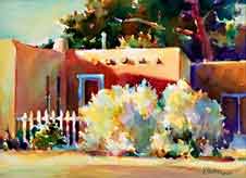
Critique by Ken Hosmer
This critique is done by
Ken Hosmer
http://www.kenhosmer.com
Ken is an excellent watercolorist, as you can see from the marvelous example below.
Nancy Hanley writes:
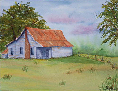
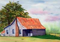
I have been painting for quite some time, I started out in watercolor, then changed over to acrylics (sometimes on canvas, mostly on gourds, I will send you a photo of those also if you are interested), anyway back to the current topic. The work I do on the gourds has taken a great deal of my time, or maybe I should say all of it, but last year I decided that I wanted to watercolor again. So...when I have time I like to watercolor(and here lately I have just been taking the time). I have been trying to learn how to paint trees, and this one is one of my better attempts, thanks to the demo you did on them. Thanks, Nancy PS. This painting was done somewhat from a photo, the old house especially.
Hello Nancy,
Since you are interested in learning to paint trees, let's focus on that first. Two important things that I like about your main tree is that you have created a good silhouette shape for the tree. This is very important. Second, when I look closely, I see that you have varied the greens and do have some warm colors mixed into the tree foliage color. If you want increase the color variation a bit more, Burnt Sienna is a great color to mix into green foliage to create color variation.
The main improvement to the painting would be to increase the feeling
of light and shadow. First ask yourself, 'Which direction is the light coming
from?' Let's say, above and from the left, which means more light on the left
side and on the top of the tree.
Subdivide the tree foliage into two parts, light foliage and shadow foliage.
Pick a general value for each area. The shadow area might be a dark value; the
light area might be a middle value. Keep the subdivision simple. Don't break the
tree into too many parts. Paint the shadow piece or pieces first--all at one time.
As you paint, hold the value to dark and vary the color randomly as you go. You
will be creating an overall shadow shape which has a distinct leafy edge. Let
this dry.
Now paint the lighter part of the tree. The light foliage will be warmer with more yellow in the green mix. A good yellow is Raw Sienna or Quinacridone Gold. As you fill in the light side, remember to hold to middle value and randomly vary the color mix as you go. Wa-Lah! You now have a three dimensional tree with a distinct light source.
Two other quick suggestions, let the shadow side (right side) of the
house be a darker overall value than the left side. Also, gradate the foreground.
Let the foreground be a darker middle value at the bottom and gradually let it
lighten as it goes up toward the house. This will give the foreground depth.
 I have attached one of my watercolor paintings as an example, using the
ideas discussed here. For more ideas please go to my web site and check
out the watercolor videos. I plan to have a new video on landscape available late
in 2009.
I have attached one of my watercolor paintings as an example, using the
ideas discussed here. For more ideas please go to my web site and check
out the watercolor videos. I plan to have a new video on landscape available late
in 2009.
Keep painting and have fun!
Ken Hosmer
www.kenhosmer.com
Additional note from the captain - Take a look at the colors within Ken's foliage. That's what makes him a master.
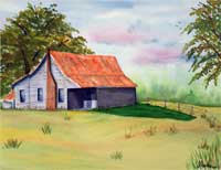
I took Nancy's painting and punched up the shadows of the house using photoshop.
Often, intensifying the values makes a huge difference.
No guts, No glory.
Finally; This is what a scissors will do for it., but that's my style, not necessarily what you should be doing.
Everything on this site is copyrighted,
Nothing may be copied or reproduced anywhere without written permission!