Critique by Jennifer Branch
This critique is done by
Jennifer Branch
http://www.JenniferBranch.com
Roger Blesi
of John Day Oregon writes:
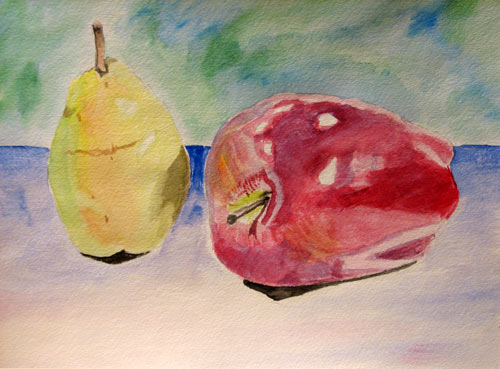
The following painting is done on 140 lb. hot press watercolor paper using student grade (reaves) watercolor. The size is 11" x 22" Thank You, I am looking forward to your critique. Roger Blesi
Dear Roger,
Nice use of contrasting colors. The blue and green background really brightens the yellow and red of the apple and pear. I'd probably go a little more blush pink, orange on the top section of the pear to contrast more. I would also blur the line between the blue and green background - lost and found edges!
The only problem with the colors is you're not done yet! I would consider this to be only half finished with several more layers to go! On each new layer, try to cover only about half of what you've painted already. Leave some holes in the wash for previous layers to show through. This texture is what really makes watercolor.
The layering is going to be much more difficult on student grade paper than artist grade paper. Artist grade paper can take some tough treatment and hundreds of layers. I typically have at least 50 layers on a painting. Student grade paper is much more delicate and can only take about 5 layers of washes. So be cautious, once you've hit it with paint, don't go back into the wash until it's completely dry. If you do, you might pull the paper up with your brush and ruin your beautiful painting! That is especially terrible when you're almost done...
Two separate objects are a very difficult composition. I can see you've placed more detail at your center of interest at the apple's stem, very nice. Try blurring the definition between the objects and their shadows a bit with a shadow wash in blues and browns that covers the shadowed areas completely (leaving small holes for texture.)
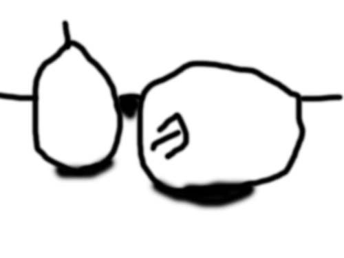
A much easier composition next time (I'm all for easy!) would be to move the pear slightly over so the apple is overlapping it. This will make your painting pull together much easier. To simulate that coherence this time, just tone down the blue background between the pear and apple. Paint a wash over the area, pulling it into the shadows on the pear and apple. Now you've pulled the composition together!
Another composition note is to not isolate an object in the middle of the painting. Run the subjects (or their blurred shadows) off the painting in at least one place. This gives the viewer's eye a place to enter the painting.
Pulling together Composition
What you have:
What moving the pear and apple and running a shadow off the edge would give you:
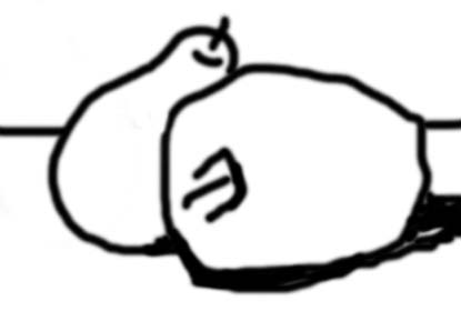
What moving the pear and apple would give you +
Blurring some of the edges to pull the viewer's eye in and keep it at the center of interest
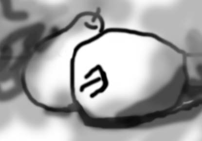
You can see how just blurring a few harsh lines makes the composition pop. Those lines are pulling the viewer's eye right out of the painting.
So for this painting:
1. Don't touch around the apple's stem, it's absolutely gorgeous and beautiful with the yellow green running into the red. Also, keep that yellow blush tone on the apple. Don't go into the white or highlight areas on the pear.
2. Paint at least 3 layers more of color! Make sure each layer only goes on half of what you just painted and always that the paper is bone dry between washes.
3. Merge the shadows on the objects and the shadows on the table together. Also blur the contrasts between the apple and pear.
That's it! Great painting! Thank you so much for letting me see it!
NOTE FROM THE CAPTAIN
In the words of my first great watercolor teacher, Brian Atieo.
Connect, Connect, Connect.
It feels wonderful when a student tells me I have helped them. Thank you so much Rodger. I Thought those trees looked a lot like mine.
Please forgive me for tossing the one on the right. Very often I become invested in some extraneous element in a painting. It kills me to take the knife to it. The feeling is akin to that of circumcision. Alas, sometimes ruthlessness is a virtue. Go figure.
Everything on this site is copyrighted,
Nothing may be copied or reproduced anywhere without written permission!